Feeding Pets of the Homeless
UX Design Case Study
Context
Feeding Pets of the Homeless (FPH) is a non-profit organization in Nevada that provides pet food, other items, and emergency veterinary care to pets of people experiencing homelessness.
FPH has over 100+ donation sites nationwide, has collected over 2 million pounds of pet food, and given over 5 million dollars in veterinary care and pet crates.
During my time with Commit the Change, I was able to design a portal that would ease FPH's workflow, ensuring that more furry companions received the support they require.
Role
UI/UX Designer - User Experience, User Journeys, User Flows, User Personas, Competitive Analysis. Worked specifically on the Business (donation site) Dashboard.
Team
Minh N. (Design Lead), Christine N. (Designer), Michelle P. (Designer), Kaitlyn T. (Designer)
Josh L. (Tech Lead), Madhu S. (Tech Lead), and 14 other developers.
Duration
November 2023 to May 2024
Tools
Figma, FigJam, Slack, Zoom, Google Docs
~~~
The Problem
At Feeding Pets of the Homeless (FPH), the current process of gathering information from donation sites across the nation relies heavily on manual reporting. This manual approach proves inefficient and opens the door to miscommunication. Additionally, the burden of reminding these donation sites about submitting their forms falls on FPH, often requiring manually written emails to prompt action.
So, the problem we wanted to solve was:
How might we build a functional, efficient portal that keeps track of donation amounts in order to showcase donation impact, manage donations, and provide FPH with up-to-date information on donation sites?
Solution
We developed a dashboard to streamline onboarding and donation reporting for donation sites. FPH would now be able to oversee all sites, monitor onboarding, and review or remind sites to submit donation forms through the platform.
Our primary users were to be FPH (AKA the non-profit organization), and our secondary users were to be donation sites (AKA stores that would accept donations and report donation amounts).
Research
We wanted to make sure we thoroughly understood the problem we were addressing before we started designing, so we partook in:
User Interviews, User Personas, User Journeys, and Competitive Analysis.
User Interviews
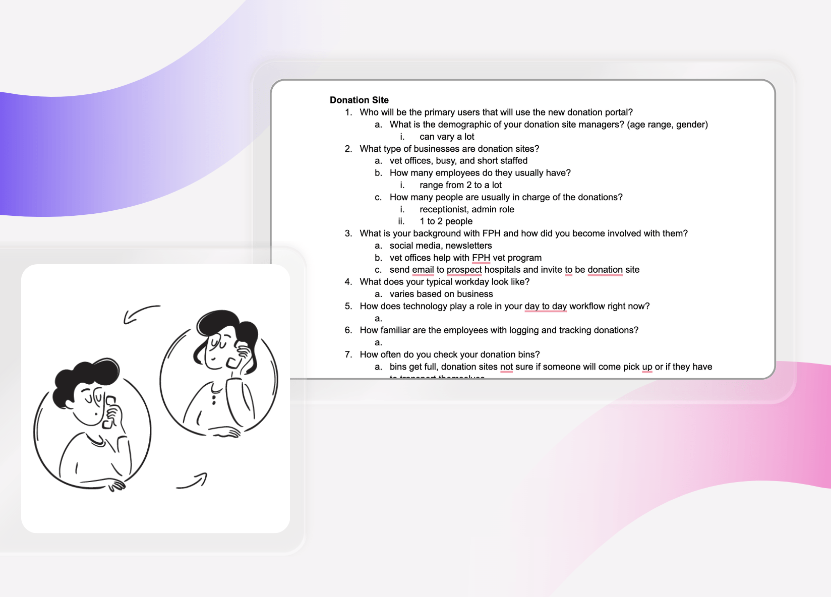
I was able to interview our primary users directly during a meeting early in our design process. We were able to discuss things such as:
- The demographics of the employees
- Their typical workday and use of technology
- Common frustrations with the current system in place
Through our interviews, we uncovered valuable insights into the challenges faced by donation site managers, including time constraints, administrative burdens, and the need for simplified donation reporting processes.
Knowing this, I was able to prioritize features such as intuitive reporting interfaces, automated reminders, and streamlined communication channels to enhance efficiency and usability.
User Personas and User Journey
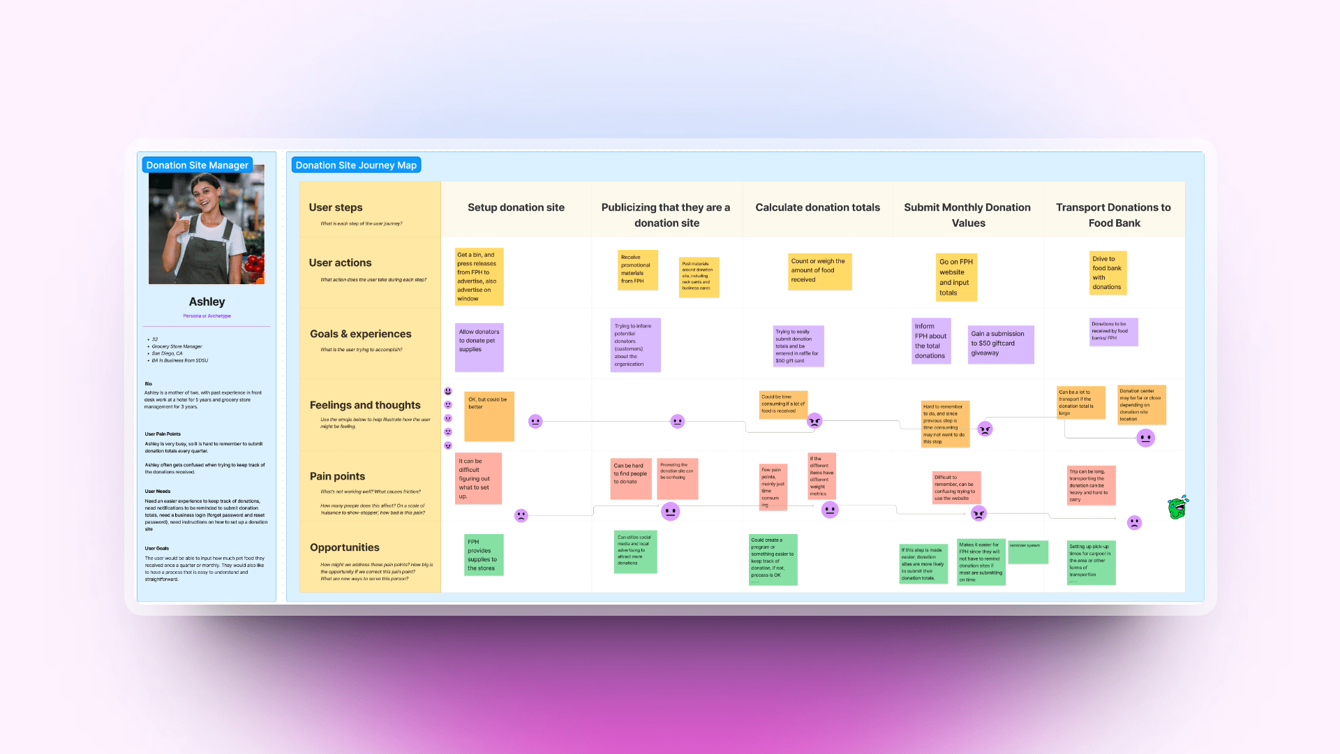
I created a user persona and user journey to better understand who would be using our website. This was especially helpful in brainstorming our website's functionality, as we laid out our user's pain points. I was able to identify possible opportunities to solve them, such as urgent notifications to help businesses remember to upload donation forms.
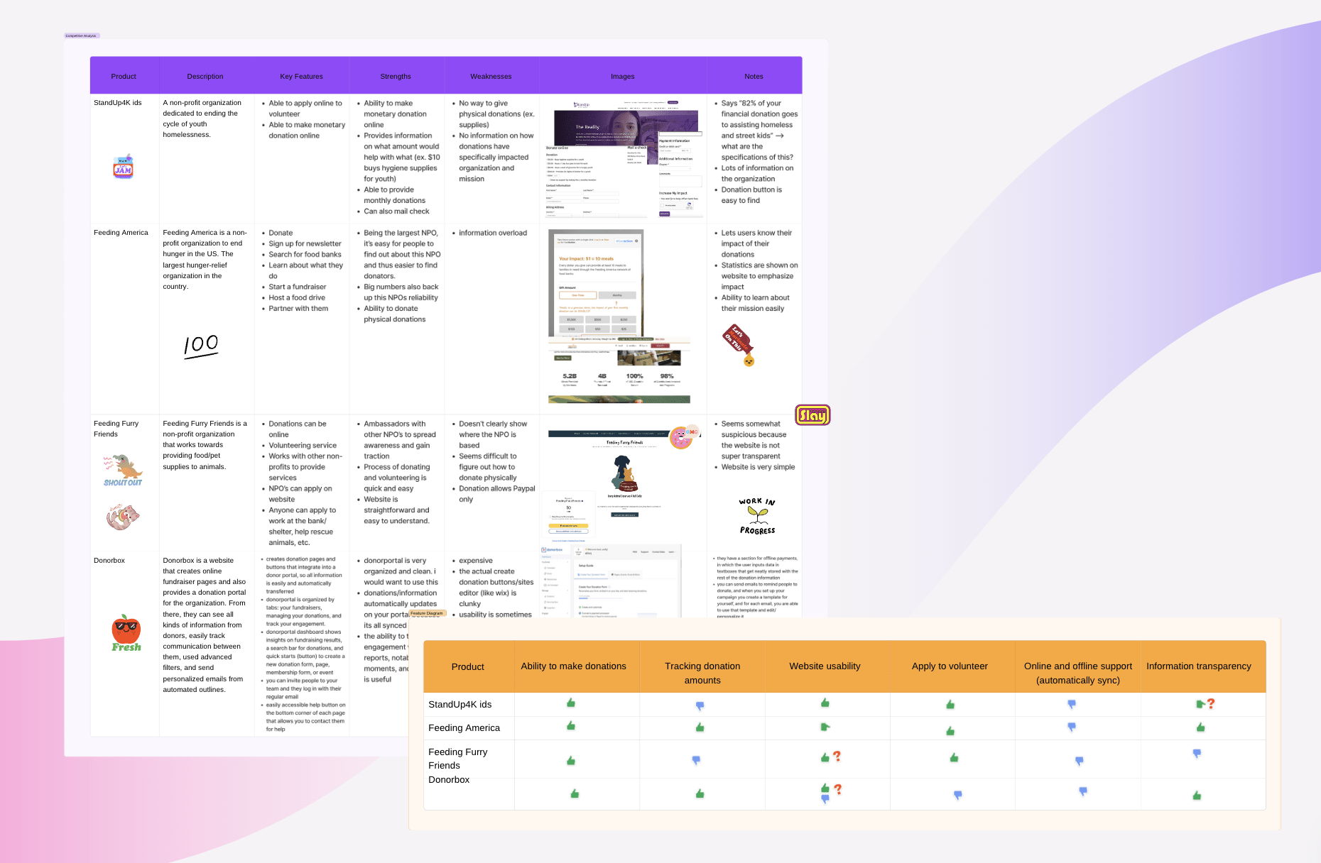
To gain a comprehensive understanding of donation websites, we began by identifying existing websites operating within the space of donation management and support for homeless pets. Our research involved a diverse range of organizations, platforms, and initiatives with similar missions or offerings.
Our main find was that while many competitors offered donation functionalities, we found that some lacked flexibility in donation options or had cumbersome processes for donors to navigate. So, in our designs we ensured that users were able to make donations seamlessly through various channels.
Competitive Analysis
~~~
Home
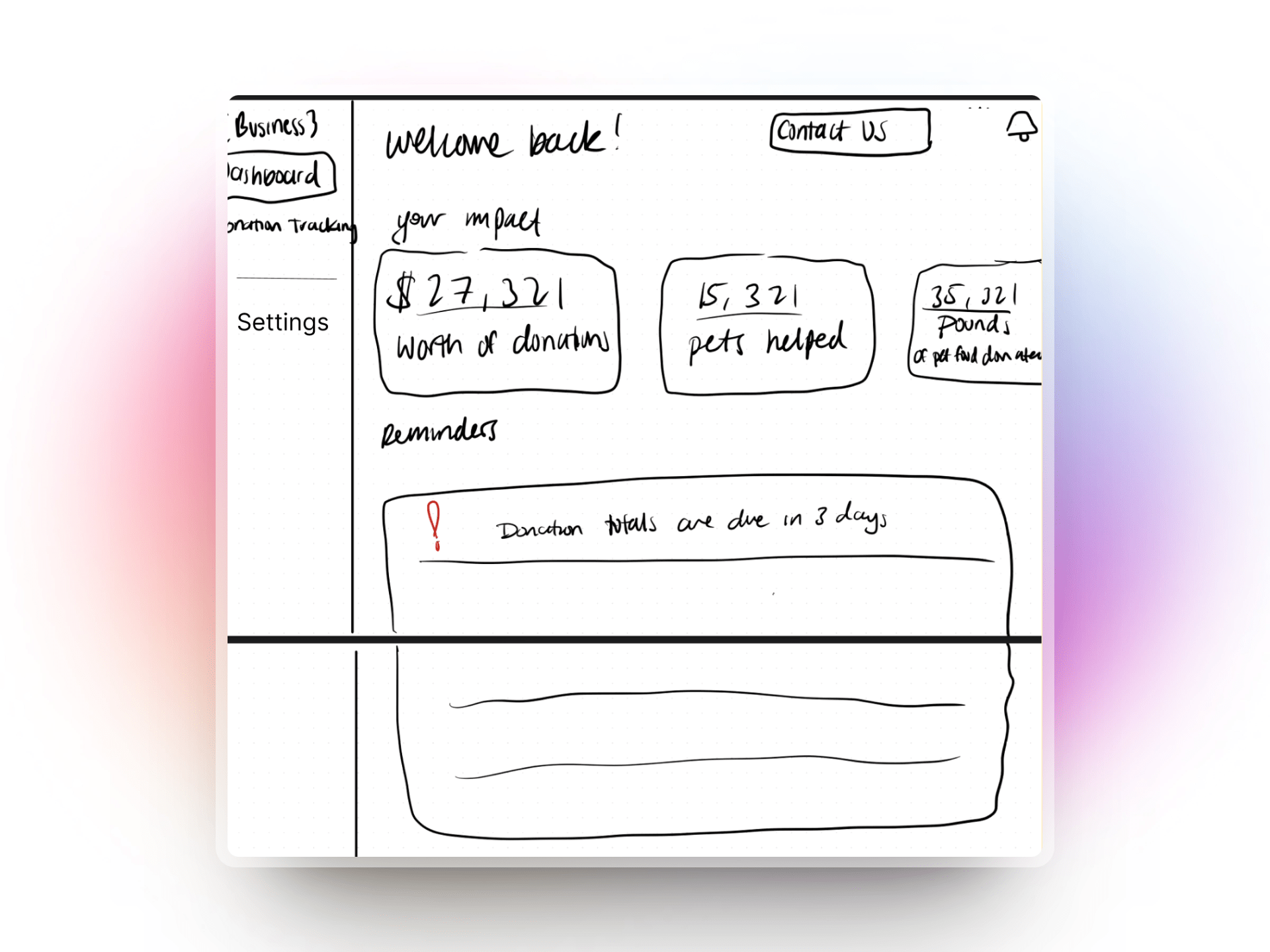
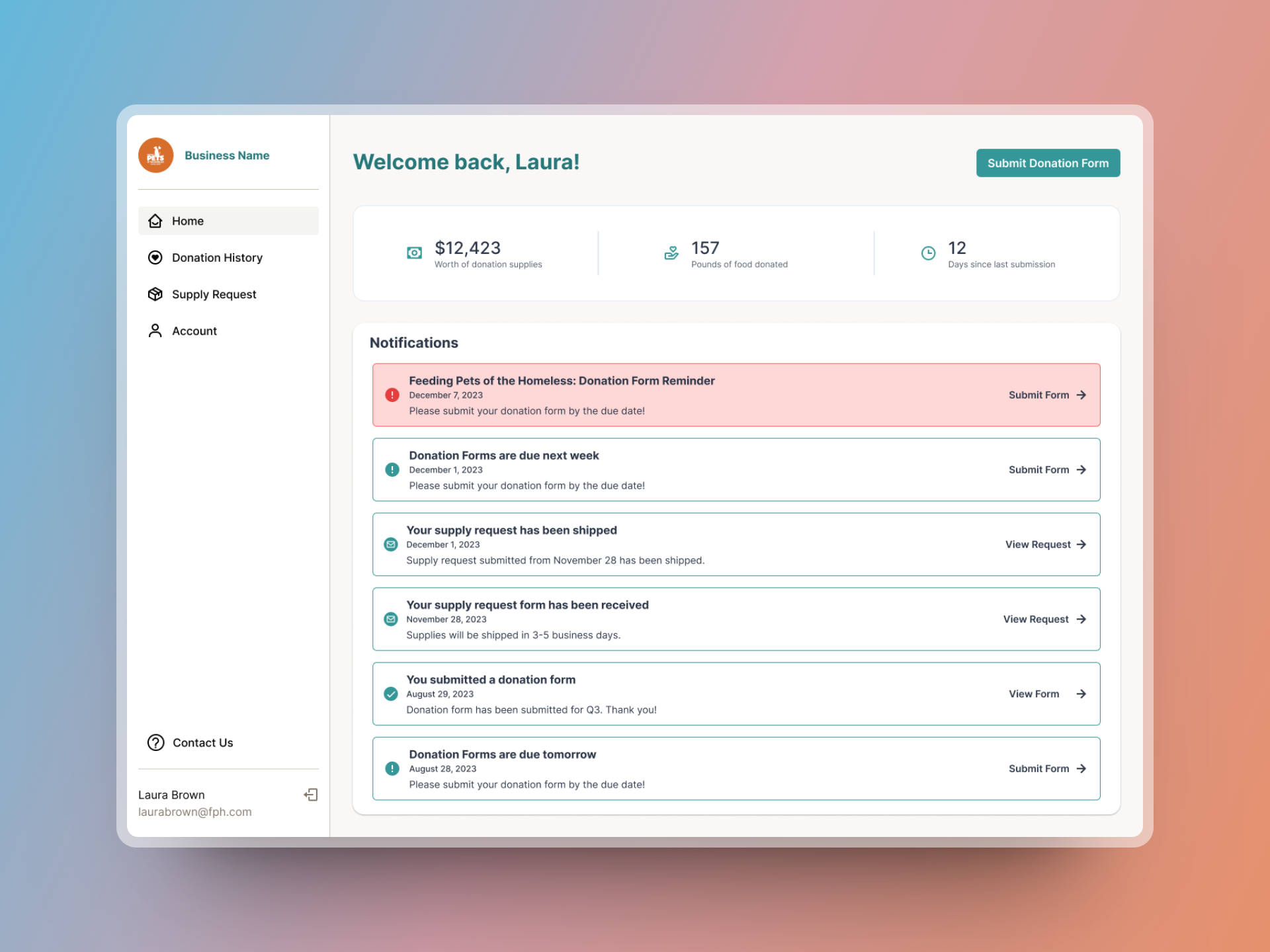
The Home page was the main focal point of this project for me. There were many, many iterations of the home page.
What we Delivered
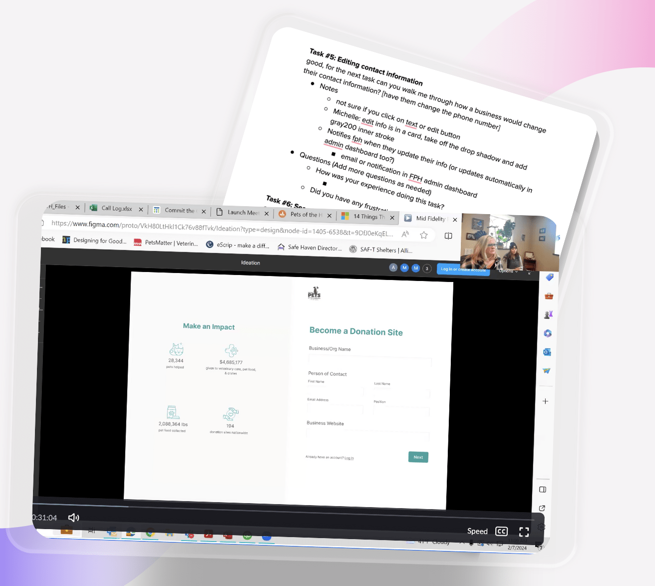
After research, it was finally time to start designing. I created the donation sites' interface, while the rest of my team worked on FPH's dashboard and onboarding.The donation sites' interface consisted of the following:
Home, Supply Request, Settings, Notification Center, and FPH's Contact Information.
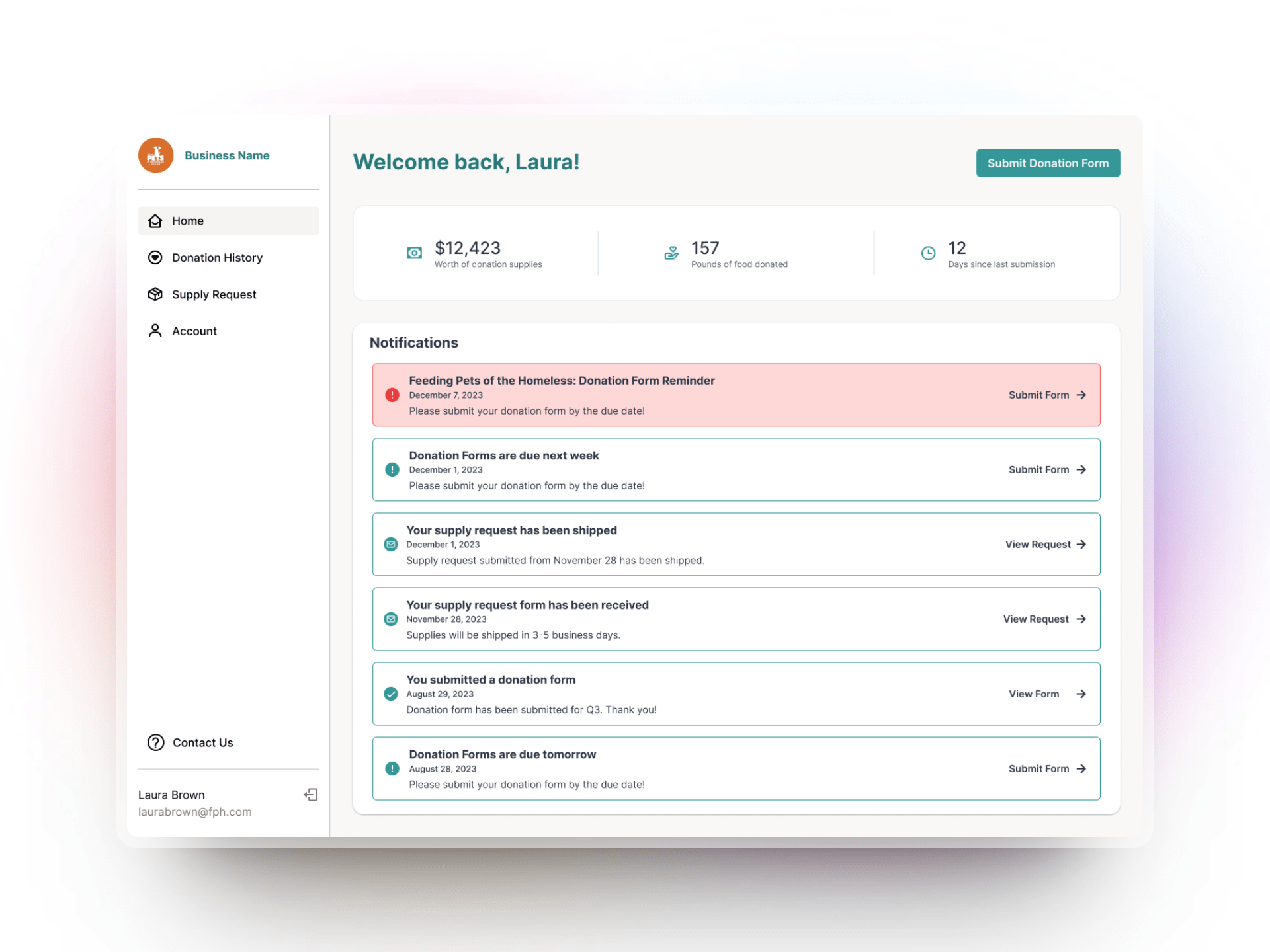
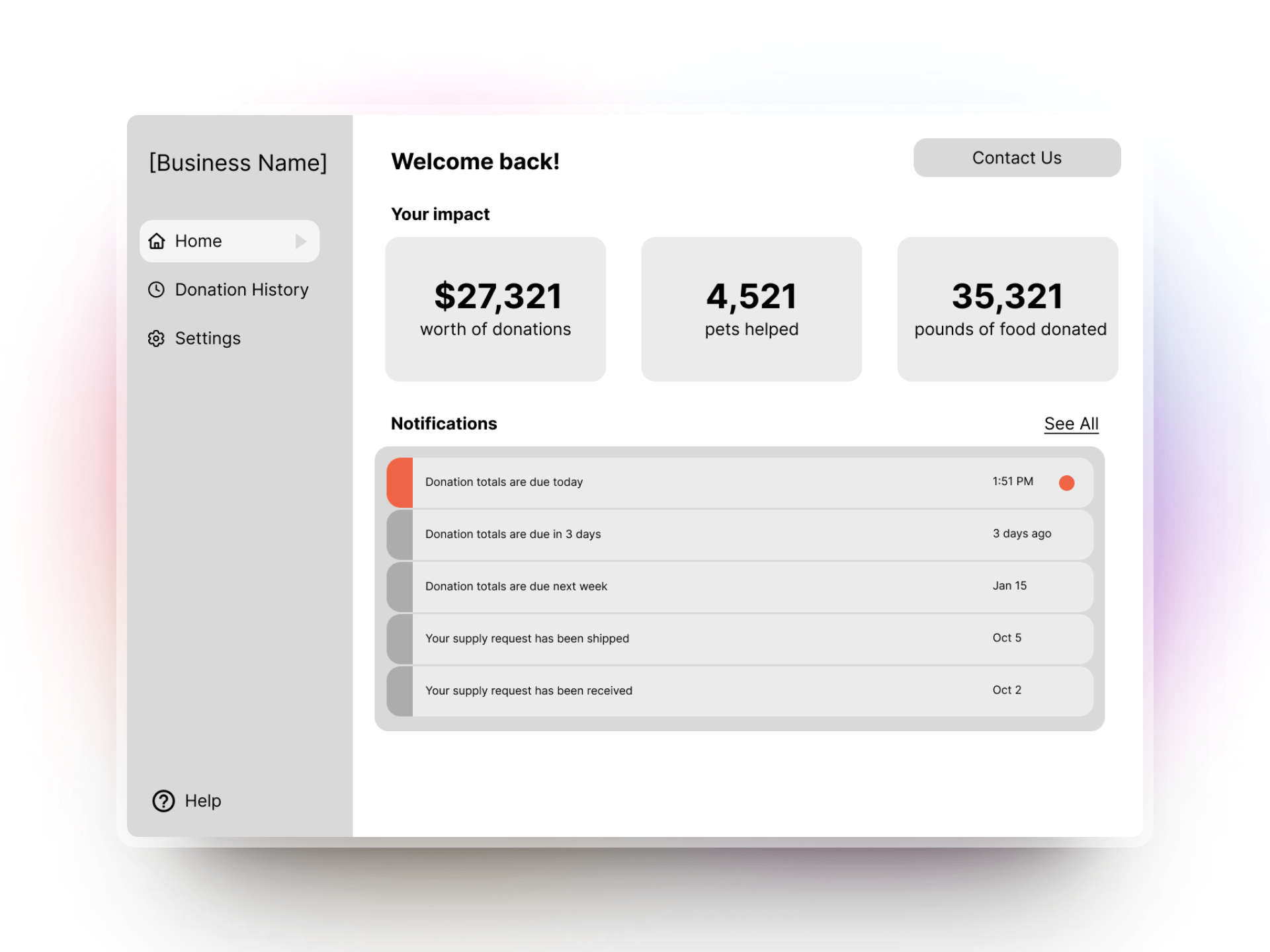
One of the main problems that FPH was dealing with was donation sites not submitting their totals in time. To minimize this, I created a dashboard that showcased their impact, as well as a notification center with urgent notifications.
- Their impact shows the dollar amount of their total donations, the total pounds they have donated, and the number of days since their last form submission; If businesses were able to see the impact of their donations, they would feel more inspired to keep donating. Seeing how many days it's been since their last submission ensures they know the timeline of when to submit again.
- Their notification shows different types of notifications, such as donation forms being due; If businesses were to easily see important notifications of an upcoming due date, they would feel a sense of urgency to submit a form.
Design System
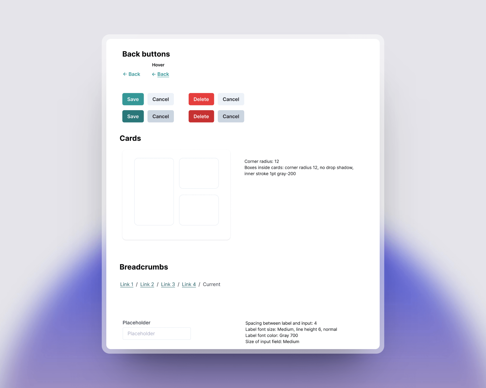
Of course, our design process wasn't 100% perfect. Midway, we realized our designs were becoming a bit disconnected with one another (such as our buttons or input screens). So, I and one other designer updated our design system. I walked away with a deeper understanding that a well-thought-out design system isn’t just about aesthetics, it’s an investment that saves time, improves collaboration, and scales the product more sustainably.
Usability Testing
But of course, our designs couldn't just be pretty, they had to be c.
So, we partook in remote usability testing so that we knew our designs made sense and were simple to navigate.
I created four tasks for our primary users to complete:
- Submitting a donation form
- Making a supply request
- Editing contact information
- Searching through donation history
One of the bigger design iterations I had to make came from this usability testing: the action of submitting a supply request. When businesses sign up to be a donation site, FPH sends them supplies to advertise their status. My first iteration had an order form, but it was unclear specifically what advertising materials they would receive. So, in my second iteration, pictures were included so users knew exactly what they were ordering.
User Guide
Finally, after all of our designs were complete, we developed a detailed User Guide on GitBooks, which includes step-by-step instructions to help anyone navigate the website with ease.
~~~
All in all
I am extremely grateful for what this project has taught me. Working directly with our users let me feel the impact of my work, and I'll forever remember seeing the smiles on their faces when they saw our designs.
As I move forward, I carry with me the lessons learned and the memories created during this project. I am excited to continue applying these insights and skills to future endeavors, knowing that this is just the beginning! :)
Thank you for viewing my case study! Feel free to browse around my other works as well.
~ Kaylee Doliente :]